Posted on Leave a comment

Urban Sketching

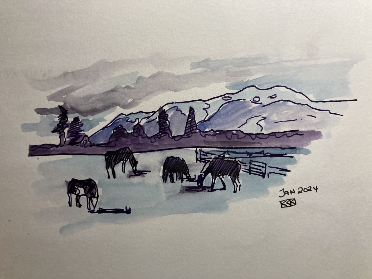
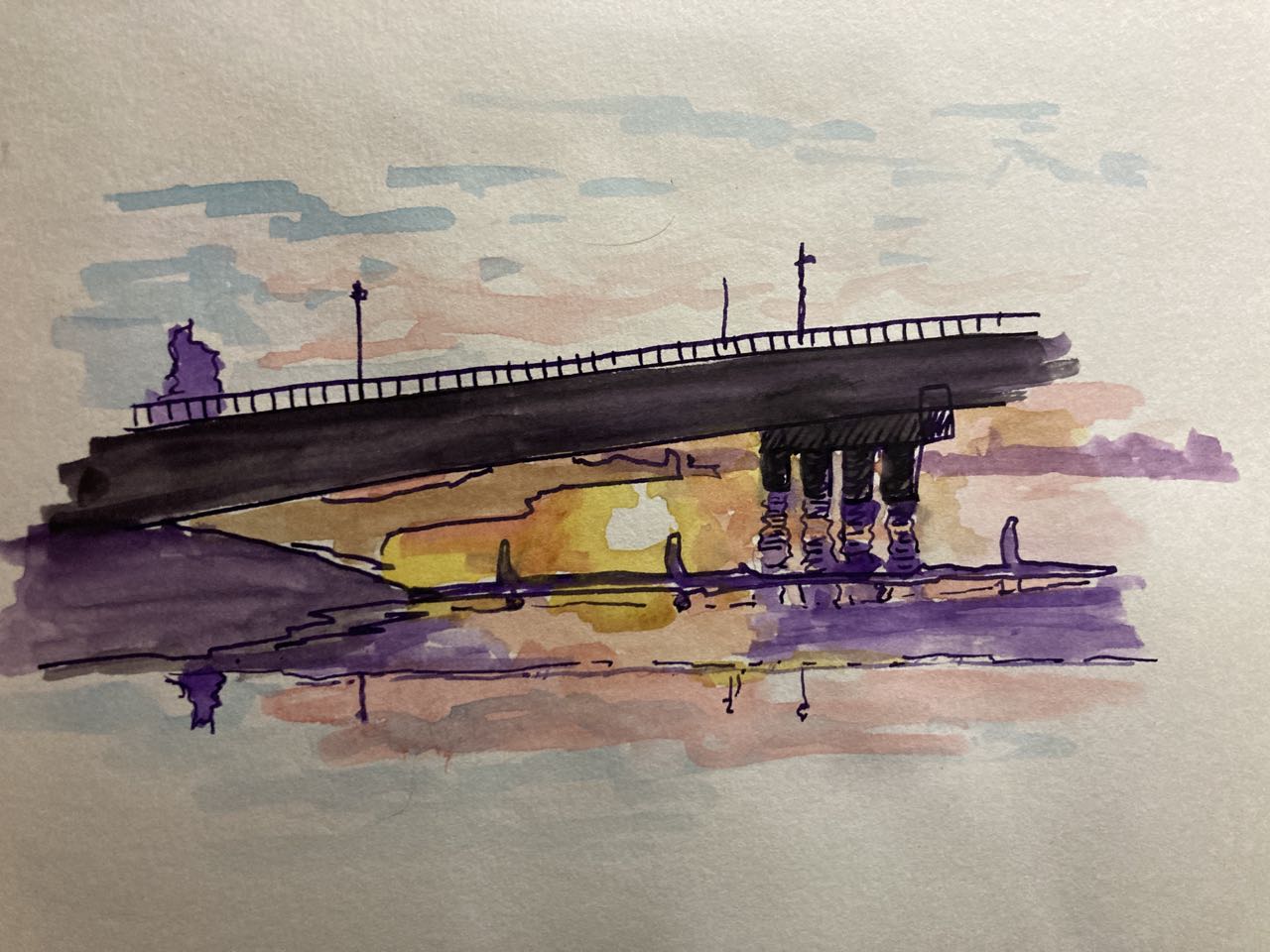
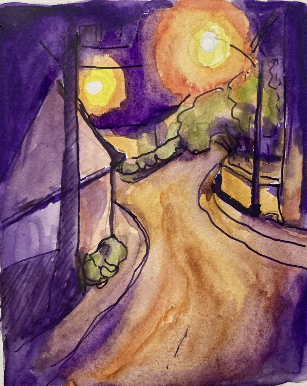
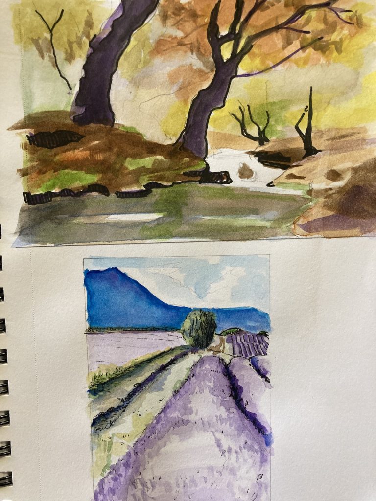
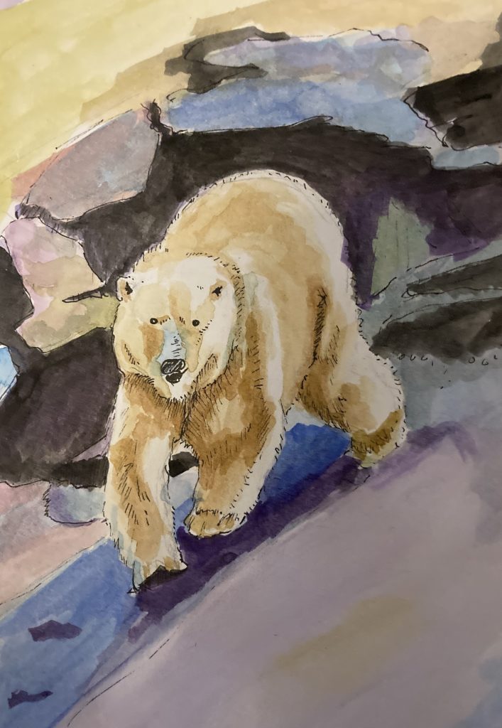
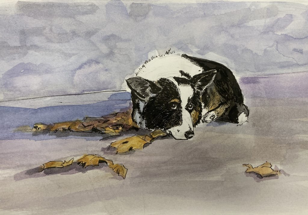
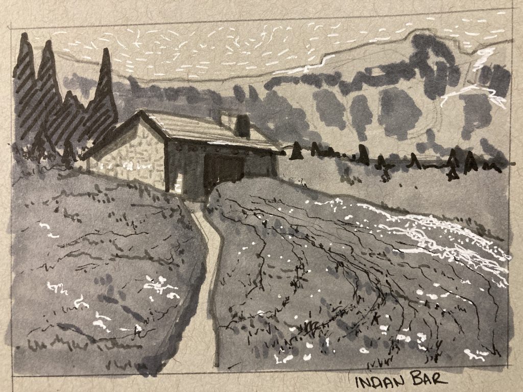
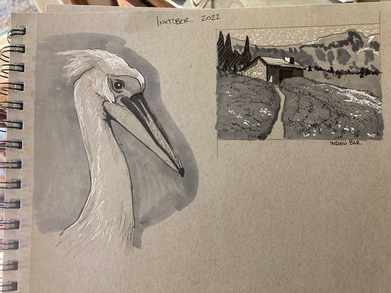
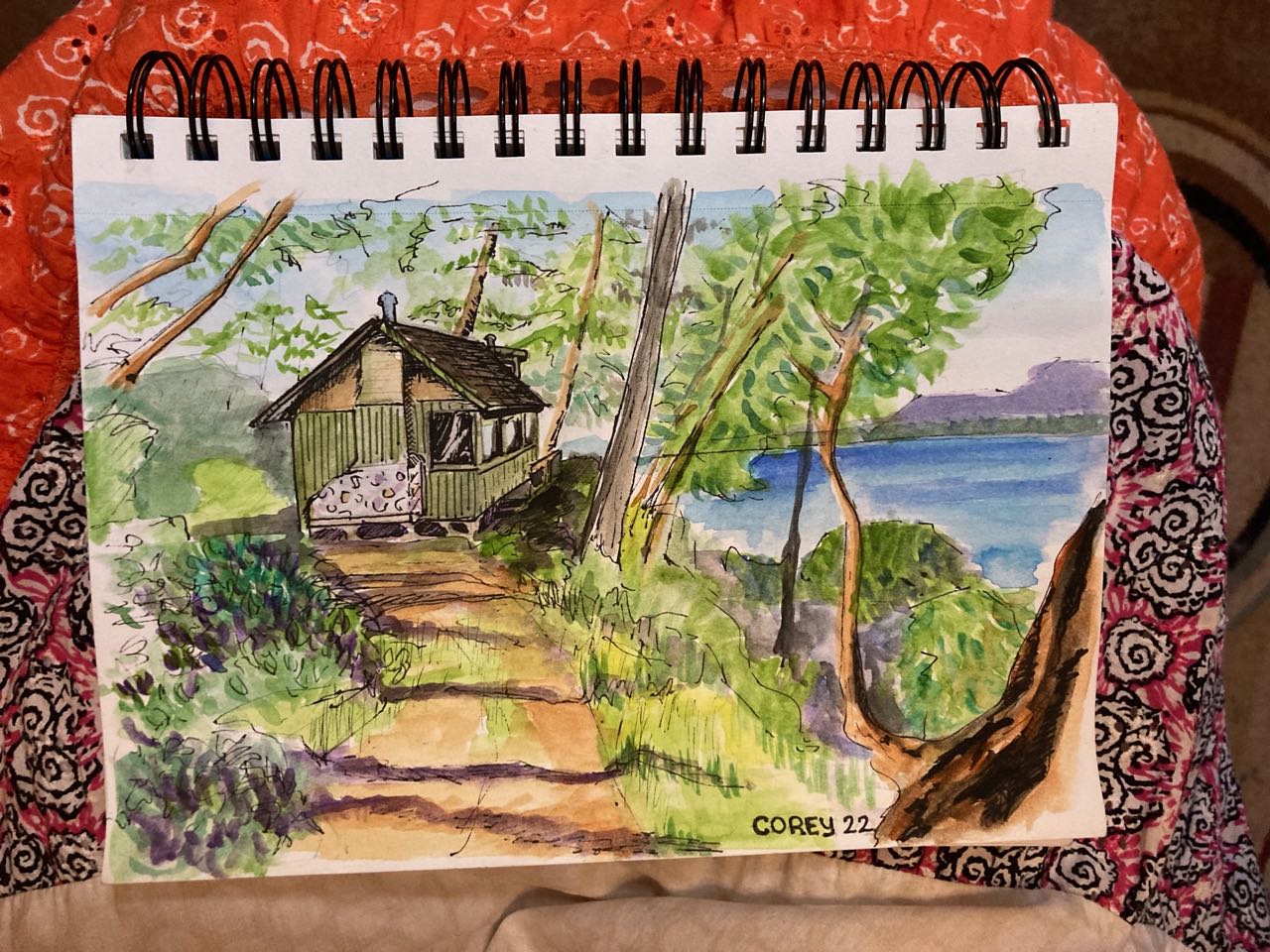
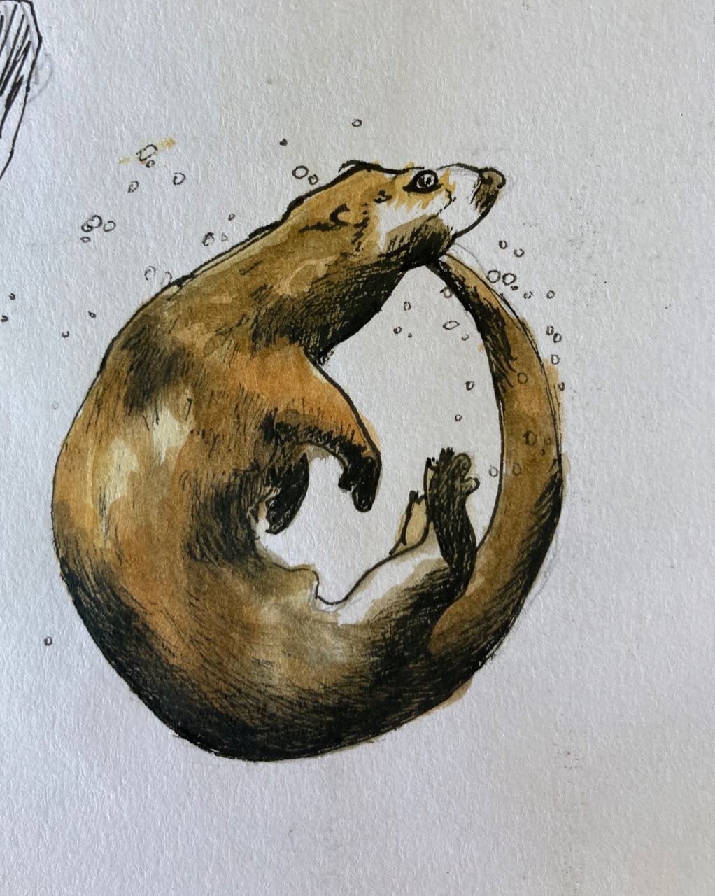
I’ve had a recent obsession with fountain pens, dip pens, pen and ink, and watercolor sketching. I’ll probably post my thoughts on fountain pen paper later. But all this led me to the world of Urban sketching – which I like because it leans into some of my strengths, namely, playing with ink, being impatient, and accuracy not mattering as much as mood and gesture.

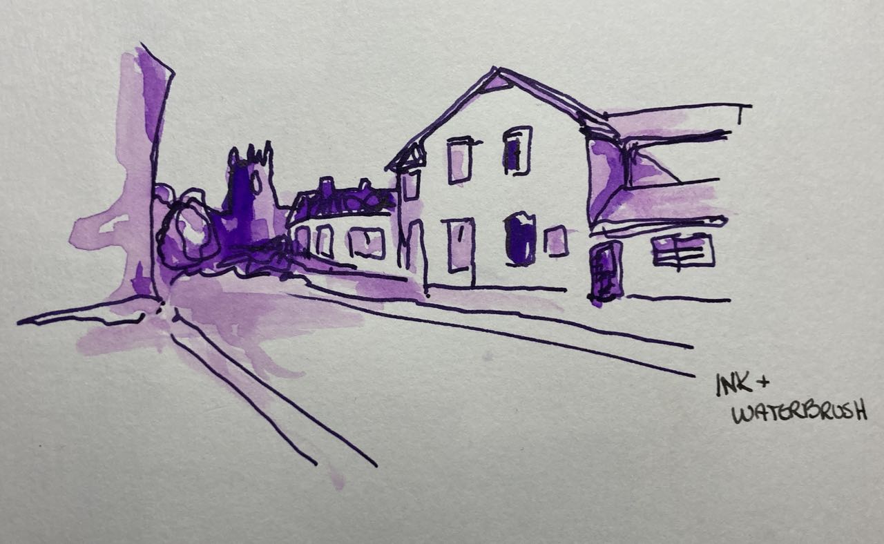
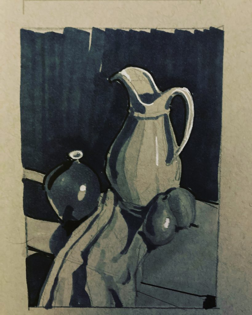
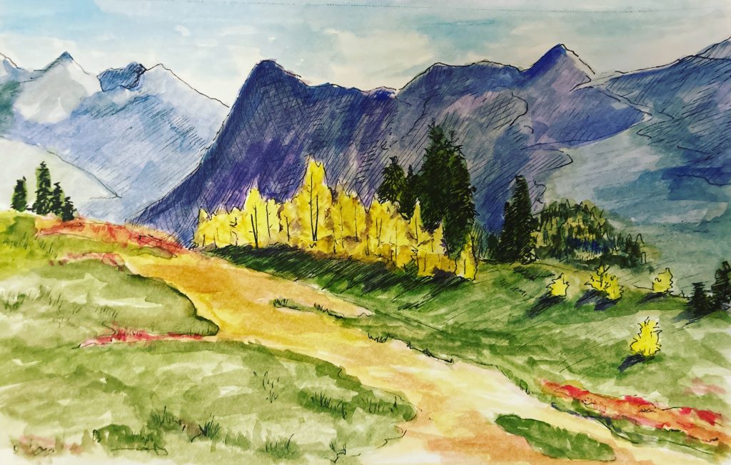
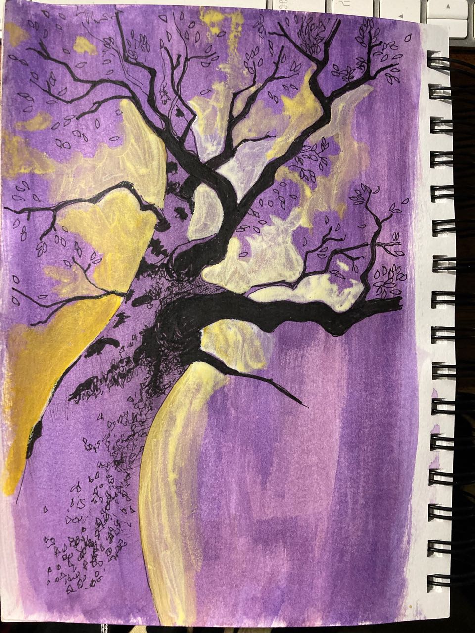
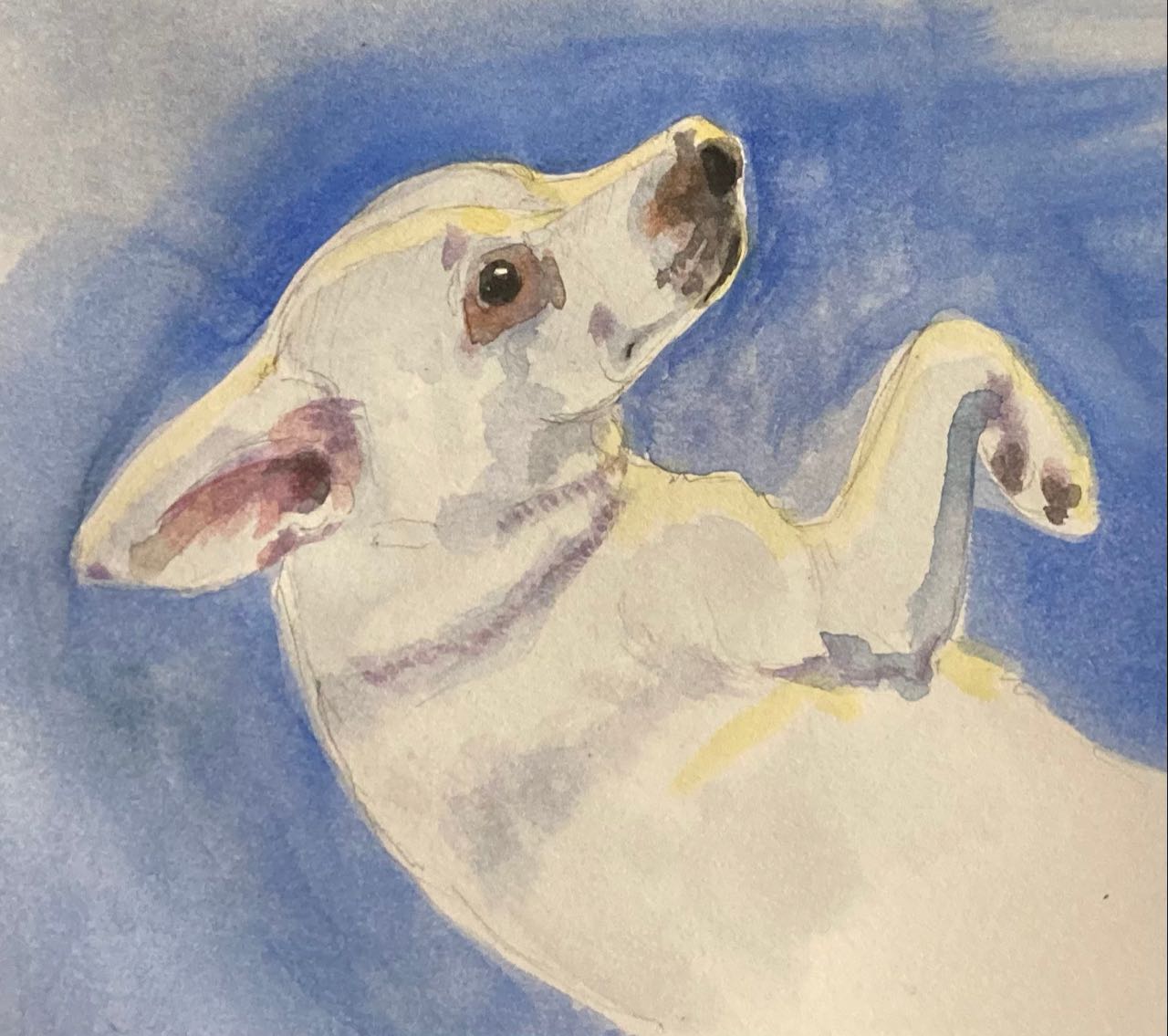
I’ve talked to some friends and we are planning to check out some local Urban Sketch clubs but in the meantime I thought I’d see if my current mixed media sketchbook could handle a little ink/watercolor. This was fun! I decided I liked purple. All the linework is done with purple india ink (although I know it looks black). Paper is Canson XL Mixed Media 160g. It buckled under the wash but dried flat enough again.

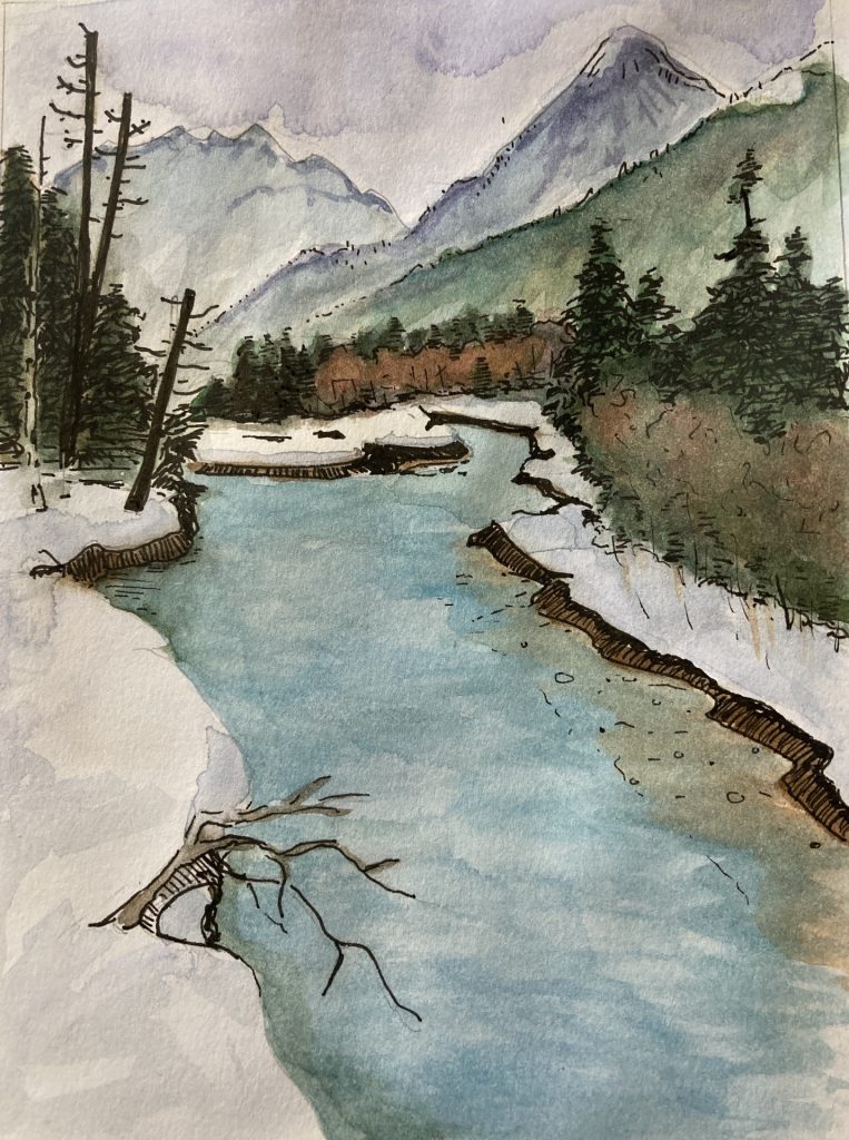
I’m also taking a composition class online from an artist I admire. I may post those images here as well eventually. So far we’ve been focusing on ‘going slow’ and ‘being careful’ – my weakness!

Posted on 2 Comments

Inktober 2022

Something that Ian Roberts (artist) wrote in one of his books was that you should expect to produce bad art. If you go to museums you can see some of the really bad to mediocre art of very famous painters because when you’re that famous people dig up everything you’ve ever done and ship it off to a museum, even if it’s something you would have left hidden in your garage forever. Having a success rate of 50%, or even 10% is still good!

Because I’m relatively new to this, and because I don’t expect anyone to ever read this blog, I’m sharing a lot of my ‘clearly learning how this works’ and ‘didn’t work’ art. Enjoy! I’m hoping I can look back at this in 3 years and see a clear improvement.

Meanwhile! I’ve been trying to sketch a little bit whenever I can and have been sharing the results as part of “Inktober”. There might be some sort of official rules about that but I’m doing what suits me. Usually this means an ink sketch with a bit of watercolor over it or more of my grayscale sketches. None of these took more than an hour or so.

To be fair: none of these are my total failures. I’m not sharing the times I made big mistakes or I got halfway through and realize that I couldn’t tell what I’d drawn and it looked like some abstract design when it wasn’t. If you look back at images I posted of entire sketchbook pages you can see some.

Jug + Vase value study (unsplash)
Landscapes from unsplash images
Polar bear (pixabay image)
My dog being adorable
Larches at Maple Pass
Wonderland value study
A snowshoeing trip

Watercolors are all on a 5.5×8.5 Canson mixed media pad with a micron pen sketch. Grayscale are Micron pen, blick marker, and Sakura white gel pens on Strathmore toned gray sketch paper. Nothing is bigger than 5 or 6 inches in any dimension.

Posted on Leave a comment

Grayscale

I’m thinking a lot about composition and have been watching videos and reading a book written by Ian Roberts (both called “Mastering Composition”). One thing he finds helpful is to make first a quick thumbnail of the overall composition, and then a small 4″x5″ value study in pencil. I’ve already indicated my dislike of pencil so I started trying this in pen. Then I had to (HAD TO I TELL YOU) buy some grayscale markers to fill in big areas and a few white gel pens for highlights.

The result is that I’m finally using up pages in a gray toned sketchbook. Some of these are failures, but what kinds of things fail is also useful information to have. (And by ‘fail’ I mean the sketch doesn’t read – I can’t tell what it is.) Some of them are also copies of famous paintings by Van Gogh or Hopper. I shared some of them for #inktober.

The plan, of course, is that something here will sufficiently inspire me to make a whole oil painting.

Posted on Leave a comment

Sketching summer of 2022

I have it in mind that I want to oil paint, that that is my primary medium and that I don’t want to get too invested in watercolor or acrylic because I should focus on one thing at a time. I’ve also realized that I have some trouble with value and composition and I should probably work out those problems in sketches BEFORE I start investing weeks to months of time working on an oil painting. As a result I started doing a lot in my sketchbook. Then I realized that sometimes I need to add color to the sketches to see how the colors will work. This is how I learned that I’m not really a fan of pencil because I don’t feel like I can get a rich enough color without spending too much time on it and I don’t like graphite pencil because it smudges too easily.

Result: I’ve started adding watercolor to my ink sketches to the point where I seem to be making tiny watercolor paintings now. What I like about them is that because I still consider them ‘sketches’ or ‘studies’ I don’t get too hung up about them having flaws. I also don’t really consider them ‘paintings’ in my own head because that would imply that I was studying watercolor technique, which I haven’t really done yet but it may happen by accident. In any case, these feel low stress and I don’t mind sharing them even when they have flaws or are unfinished.

This first one of these is of Ian-from-Canada’s house and we sent it to him along with a gift package as a ‘thank you’ for his hospitality.

Posted on 1 Comment

Early 2021

So – what am I working on now? I was joking that I’m no longer making art, I’m just looking at it. But it’s probably more accurate to say that I’m not finishing any art.

I’ve got 3 oil paintings in various stages of done-ness, one of which I had previously put away for over a year and now I’m trying to salvage it. One is a bottle painting where I decided i was unhappy with the composition so I may not finish it. Third is another portrait of my dog, because everyone loves my dog.

Other than that – I’ve just been making tiny sketches to see if I like the layout – to avoid the problem of not liking a composition once I’m half way through. I think the rock in the forest and the sketch of Chain Lakes have potential. The other looked better in my head. The chameleon was just for fun and because I wanted to see if my multimedia paper would take watercolor (it does). The glass of water was a practice study. And the portrait is about half done, I’m letting it sit a few days to see if the proportions still look right when I’ve been away from it.