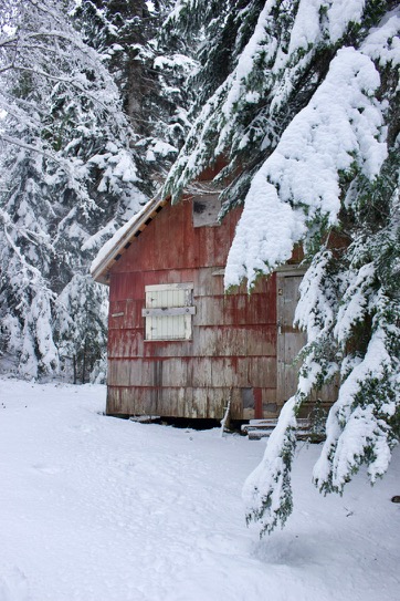
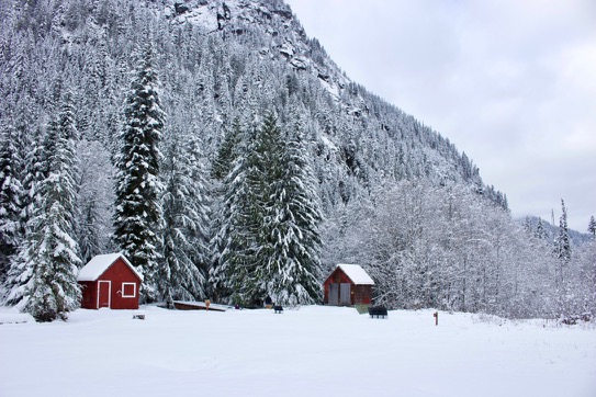
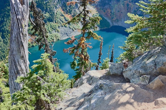
We were looking for a hike that avoided the snow up the in mountains, so in that sense, this was a failure. There was a good 6 inches of snow at the trailhead up to about a foot at the town site, but the hike was mostly flat and we were able to walk in the footsteps of the few people who went up ahead of us. It was a beautiful day, a pleasant drive, and well worth the trek.
Author: bluesun
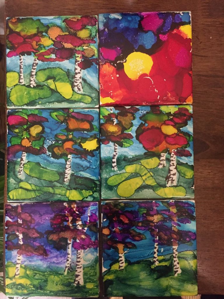
Fall colors
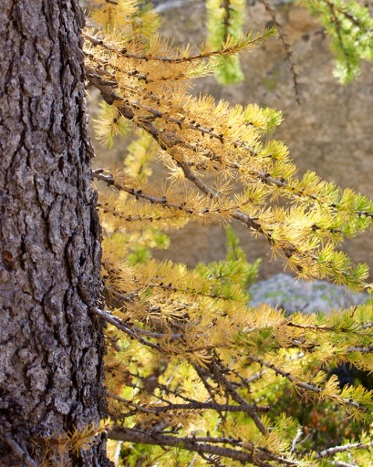
The Pacific Northwest doesn’t get the fall fireworks show that the East can get, but we do mountains much better and also, there are larches. I had never seen them before, but these are deciduous conifers and if you time it right, you can see them in full, bright yellow color up in the mountains.
These are all from Cutthroat and Maple Pass in the North Cascades. The yellow trees are larches, the bright red bushes are huckleberries and the haze is the remnant of wildfire smoke.
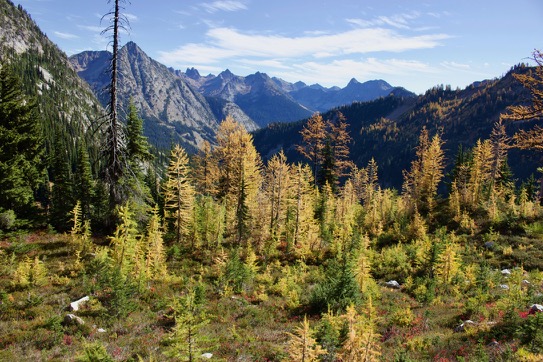
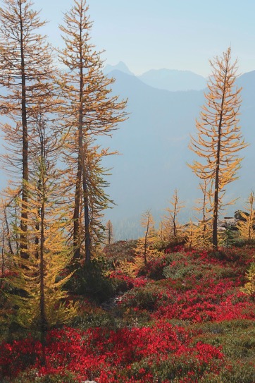
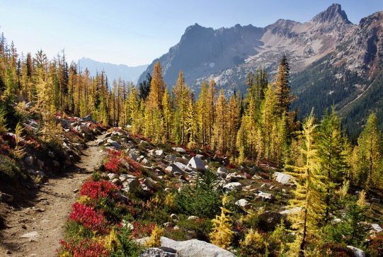
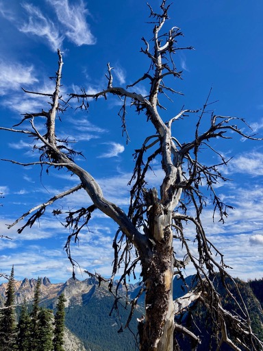
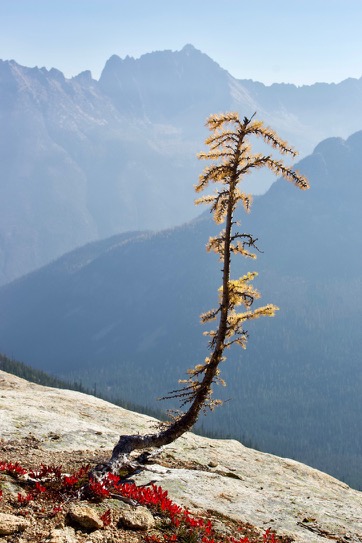
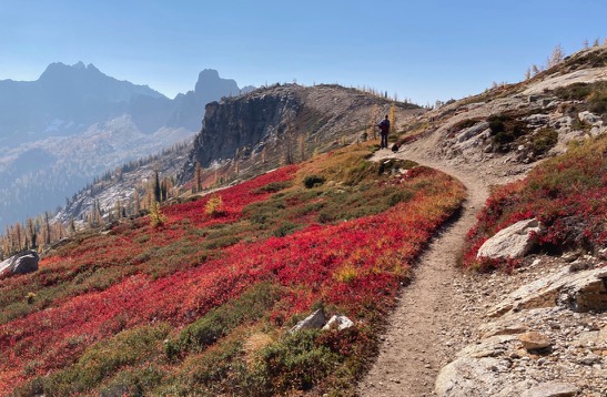
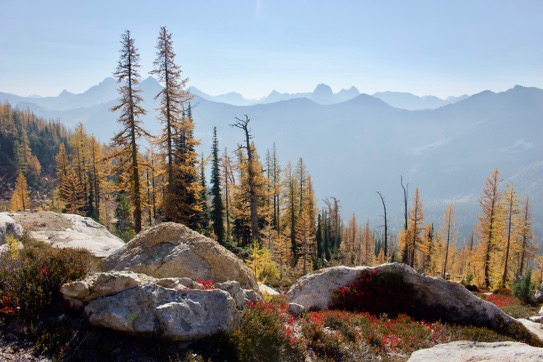
October 2020
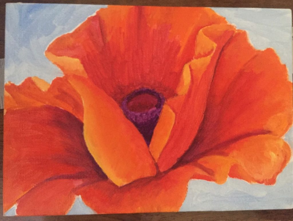
I haven’t done as much painting as I intended, but I did get a lot of hiking done before the smoke drove everything indoors. It’s cooler weather now and I’m struggling to get back outside either hiking or kayaking. In the meantime, I have some new art.
I consider these all ‘studies’ where I’m still figuring out how the medium works and most of them are on cheap canvases or paper. I am pleased overall with how the wave turned out – this was my first attempt at water. For the honey jar I really like the glowing spot and somewhat regret doing it on such a poor canvas. Same with the bottles – I had some canvas paper that I found in some art supplies from 40 years ago and used it because it was convenient.
The tree frog is pastel pencil on ‘pastelmat’ from a free reference image. I did it in something of a hurry along with an online class/tutorial, but I think it came out well.
I don’t think I’m going to reach my goal of 100.


More paintings
I set myself a goal – and that goal is to paint 100 (small) paintings before the end of the year. I’m working on the theory that what I need most is practice. I’m still doing some sketching, mostly people, but they’re not good. When I get something I like I will record it here.
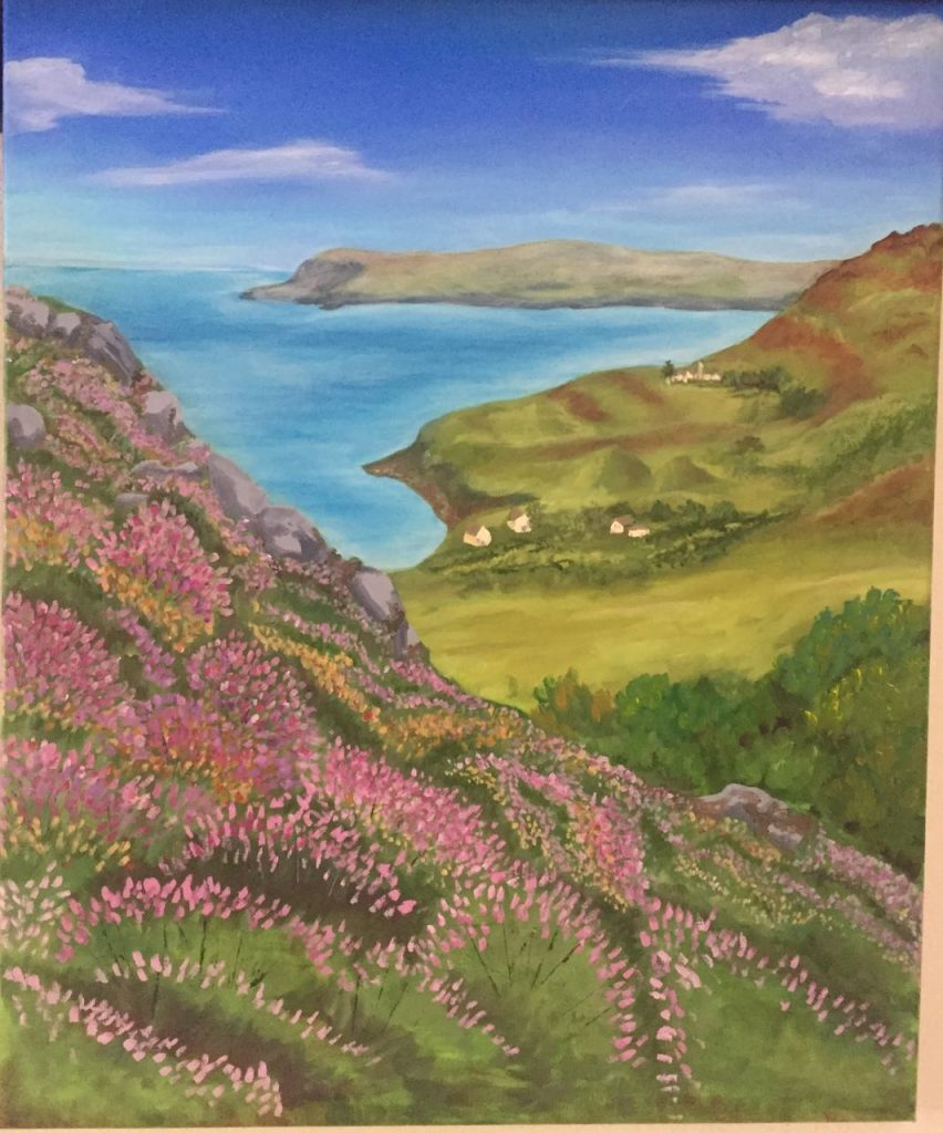
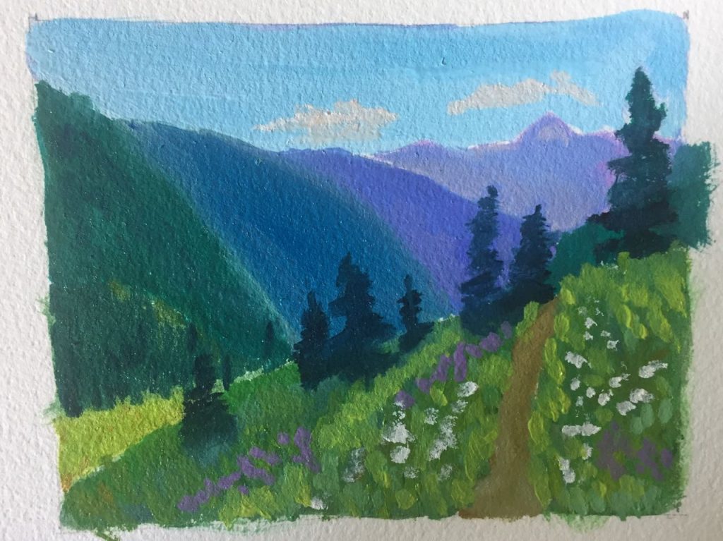
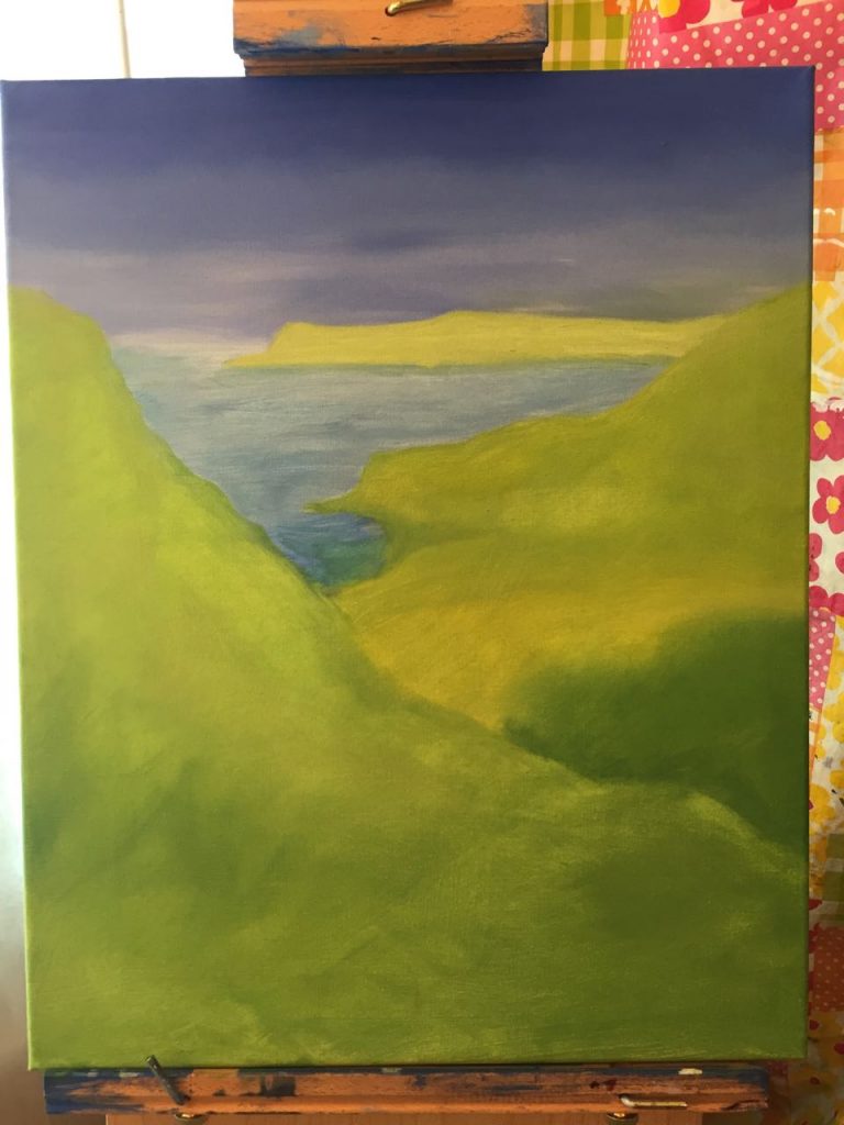
First some updates on my two landscapes. I’m not sure Dun Flodigary is completed. I haven’t worked on it for a while, but I also haven’t signed it, so there we are. If I had to do it again I would tone the sky WAY DOWN, but I don’t want to go back and mess with it now. On the Cascades – I’m just starting to add details to the grass and put the flowers in the foreground.
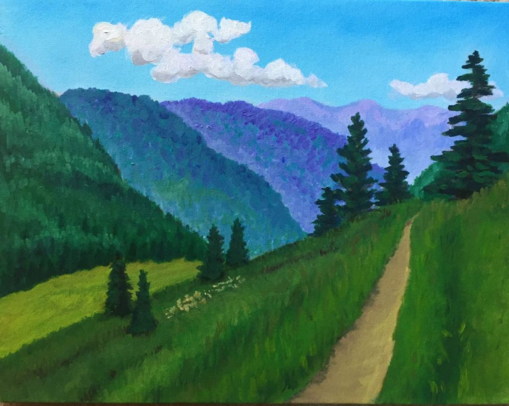
Cascades 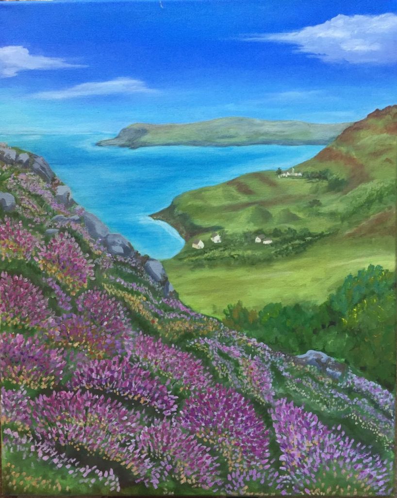
Dun Flodigary
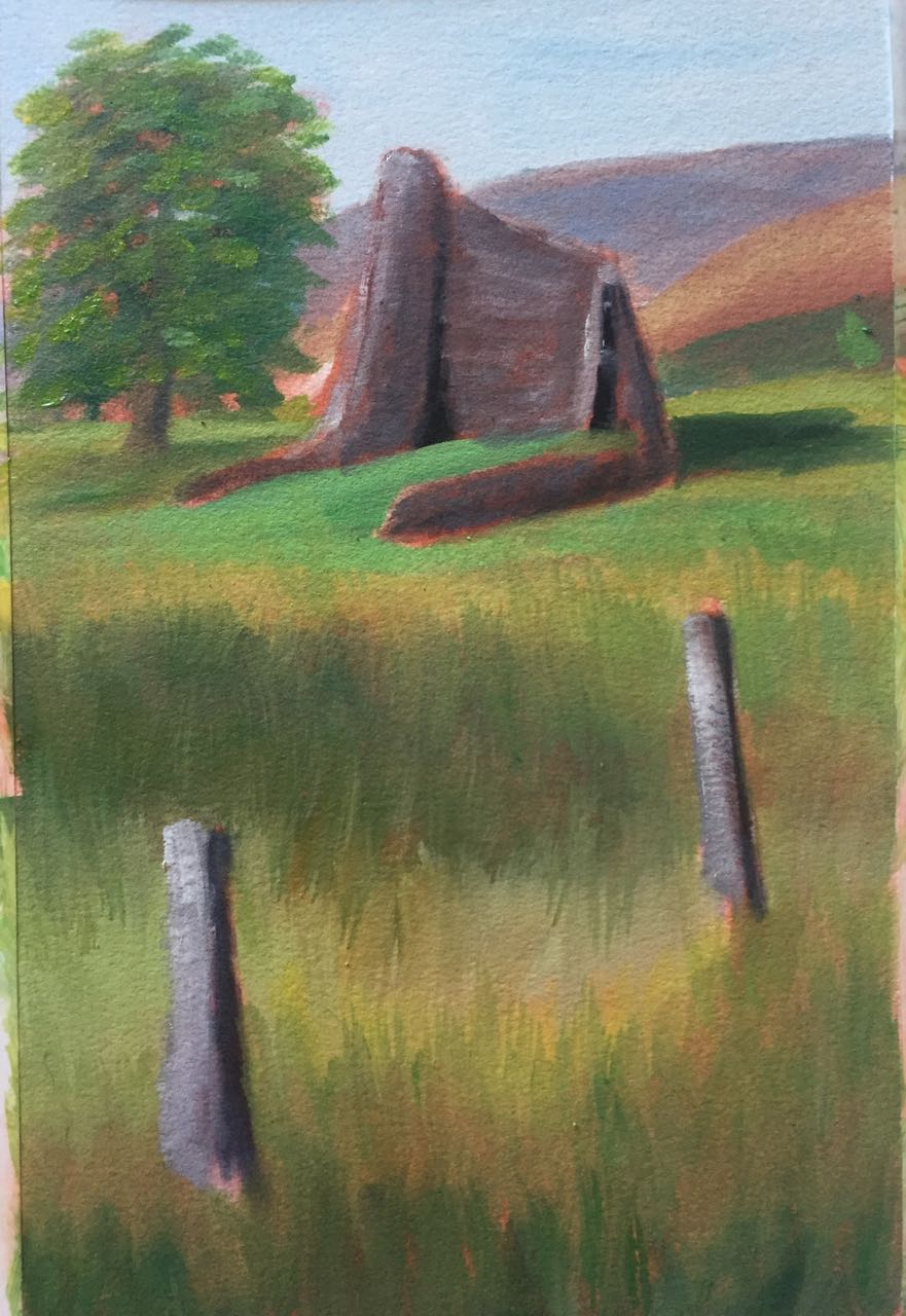
And now for some tiny art. The biggest one here is 6×9. These are the start of my 100 paintings. I’m still working on Dun Trodan, but wasn’t sure what to do next so I set it aside.

Oil painting
I’ve never painted with oils before last fall (I haven’t done much painting at all and never taken a class in it) but from the limited amount I’ve done since then I like them better than acrylic and I can’t really explain why. If you’ve ever had a game that you like because the pieces are nice, they are smooth and rounded and have a nice weight to them so that it just feels good to pick them up, that’s how I feel about oil paint vs acrylic paint. In November I was invited to start painting with friends and hopped in, hoping I’d figure out what I was doing as I went.
I started working on a landscape from a photo I took on the Isle of Skye of a heather-covered hillside and the shoreline and sea beyond. Did I mention I knew NOTHING about oil painting (or any painting?) so it’s been slow going as I stopped every time I had to work on something new.

November 2019 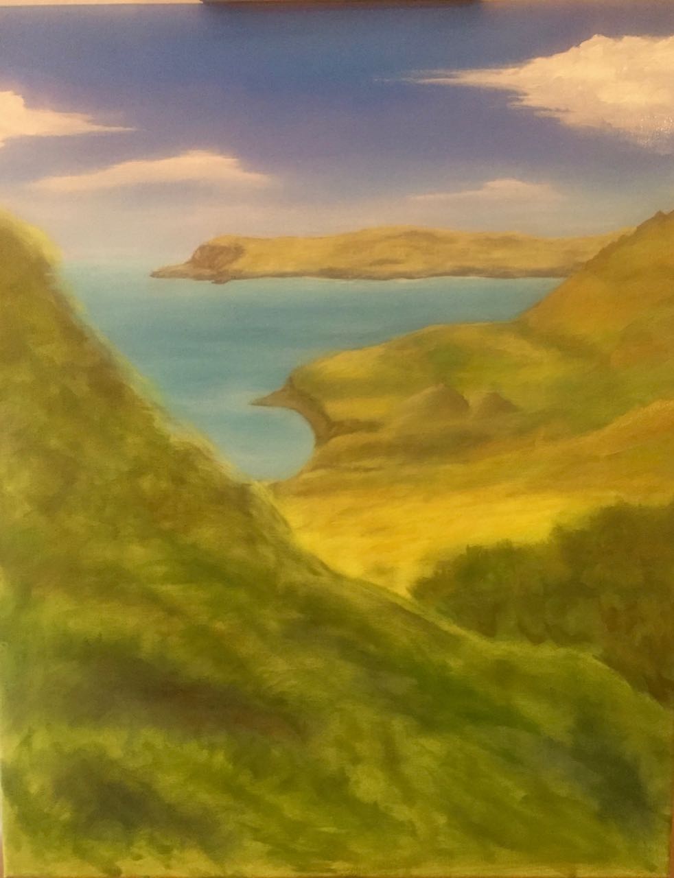
May 2020
I think it looks very much like someone’s first oil painting. The colors are too saturated, particularly the sky, and my brushwork leaves something to be desired, but I’m working on it. I need to finish up the heather and there are some details in the mid ground I want to touch up before I call it done.
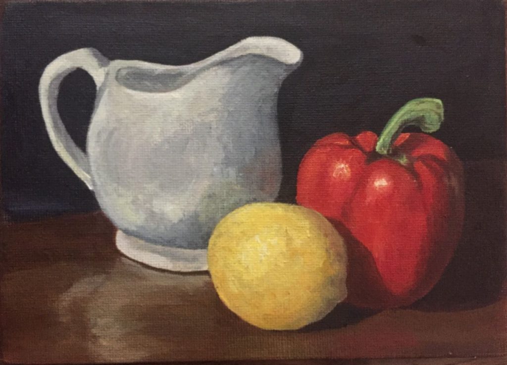
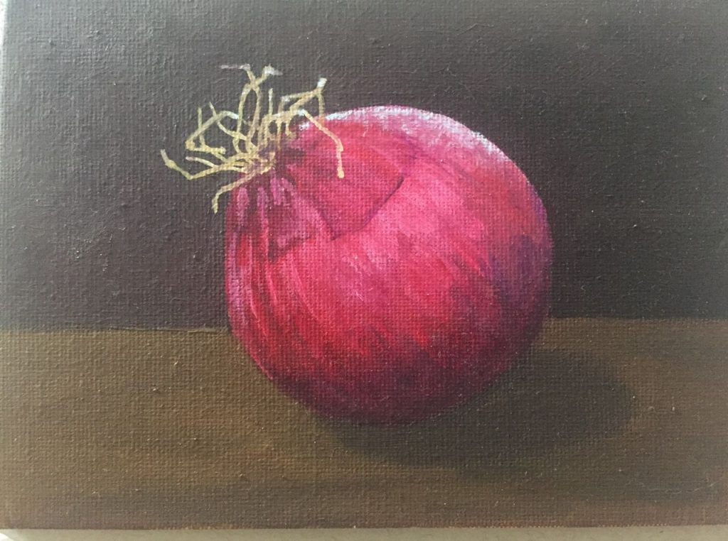
After we’d been stuck in our houses a while because of the pandemic, I decided to bring the paint supplies to my house so I can at least work on something. I was not previously a fan of the still life, but these are small, have simple shapes and are very ‘low risk’ compared to a portrait. If I’ve got some lines off on a lemon, it doesn’t make the lemon look angry.
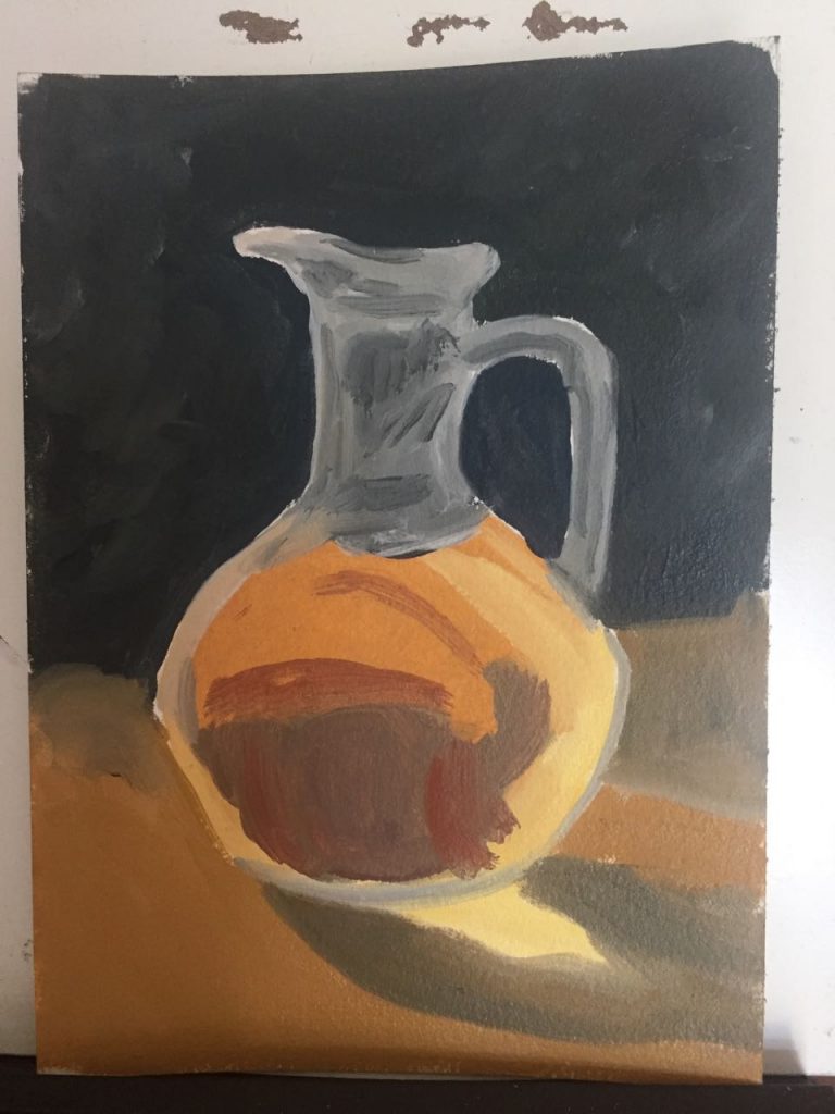
Bottle – day 1 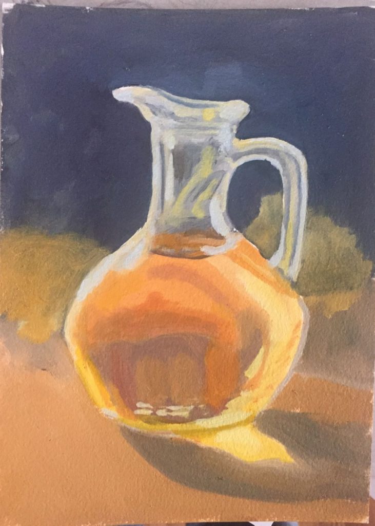
Bottle – day 2
Things I noticed: when trying to paint a white, shiny object, I should not have made the highlights pure white – it looks too chalky. It is very difficult to figure out what the shadow color on a lemon is. I am not good at painting thin lines. If I do a blend from purple to red to orange I need to really keep my brushes clean and possibly break it down over several days.
Finally, I went through my photos and decided to try another landscape. This one is small (14×11) and I’m thinking of it as a ‘practice sketch’ for something to maybe do again later but bigger. I’m playing around with a style and want to work a bit looser. I started with a practice practice sketch – a thumbnail that was only 4″ wide to get an idea of the colors.
thumbnail 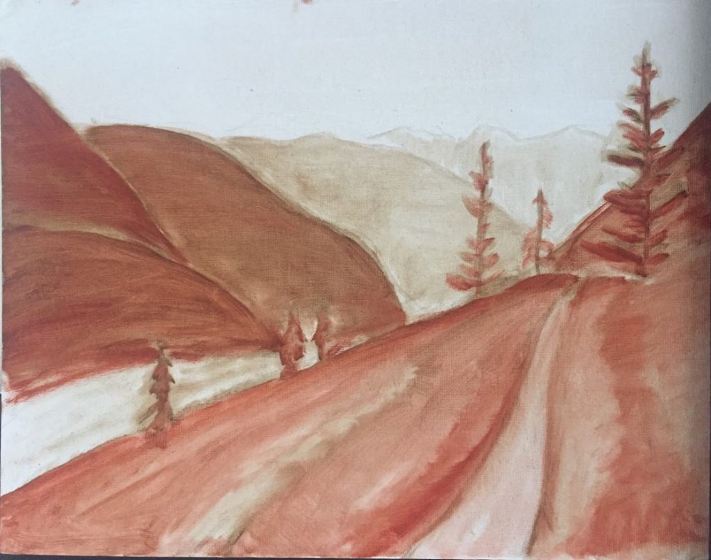
Day 1 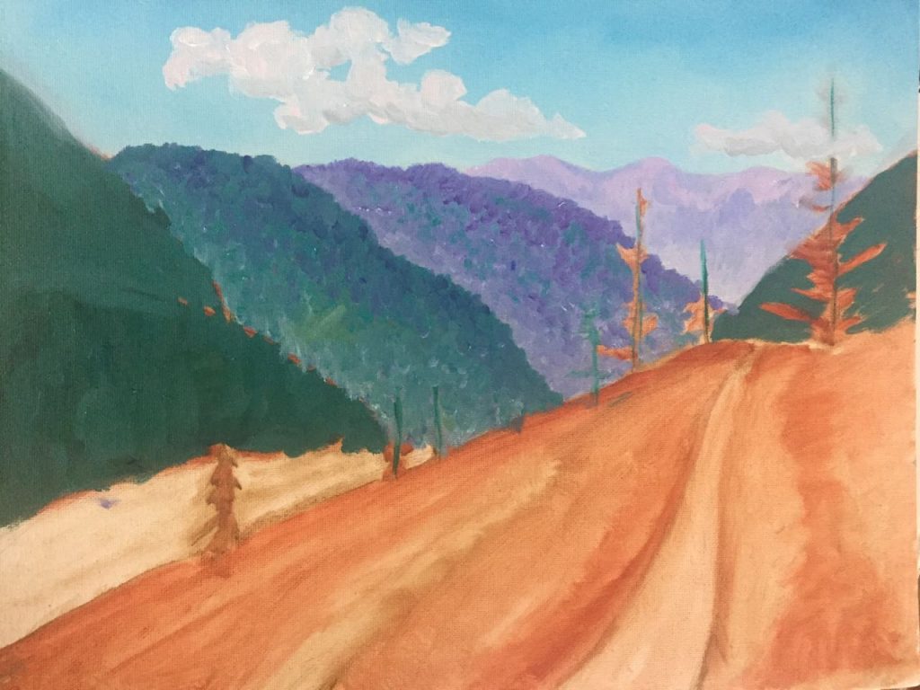
Day 2
The oils take a while to dry between layers and I’m prone to wanting to rush everything (I can create grey!) so my current solution is to always have 3-4 paintings in progress so I can jump to another when one needs time to dry.
Kingfisher
Playing with pastel pencils: test #3. Learning from my frog mistake I went a little bit bigger (but I think not big enough! This is 9×9″
What I learned:
- I need to slow down doing the backgound and get it nice and smooth.
- The stabilo pencils are water soluble and going lightly over it with a water wash once I’ve got some pastel down helps fill in the gaps were it may not be making good contact with the textured paper.
- If I want really bright colors maybe I should use a white paper
- Either I don’t like the spray fixative or I’m not using it right. The fixative made all the colors darker, made areas with only light pastel vanish, and made some heavy chalk lines in my underpainting stand out. Oh – it also revealed some lines from my pencil sketch! Working over the top. of the fixative felt a bit scratchy.
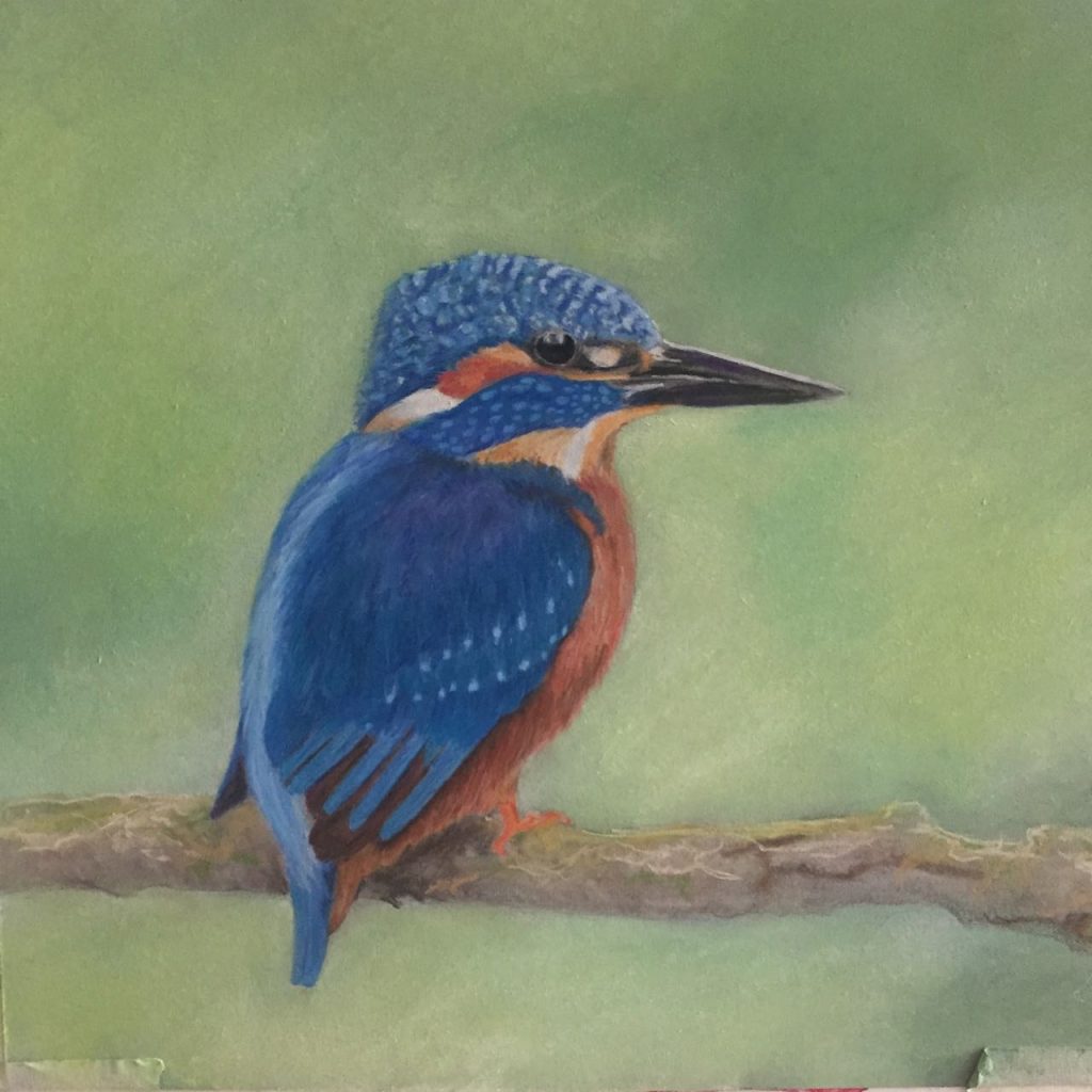
Before spray fixative 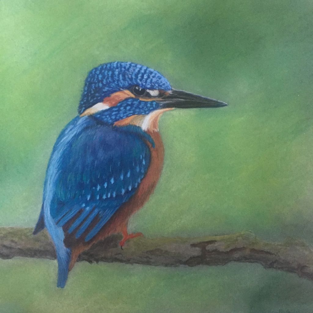
After spray fixative & touchup
Since the fixative caused so many problems I did a substantial amount of work over the top of it. It left some gummy patches so my background is not as smooth as it was, but it did really let me punch up the color and rework the spots on the feathers. Looking at it now, there is some more I could do, but now I’ve got it under some glass to protect it.
Pastels
It’s been a while, but now with everyone under a stay at home order, I’ve got plenty of time to play with art. Here are two quick studies I did to try to see how they work. I’m learning. The frog had good colors but I realized I’d made it much too small for the kind of details I wanted to use.
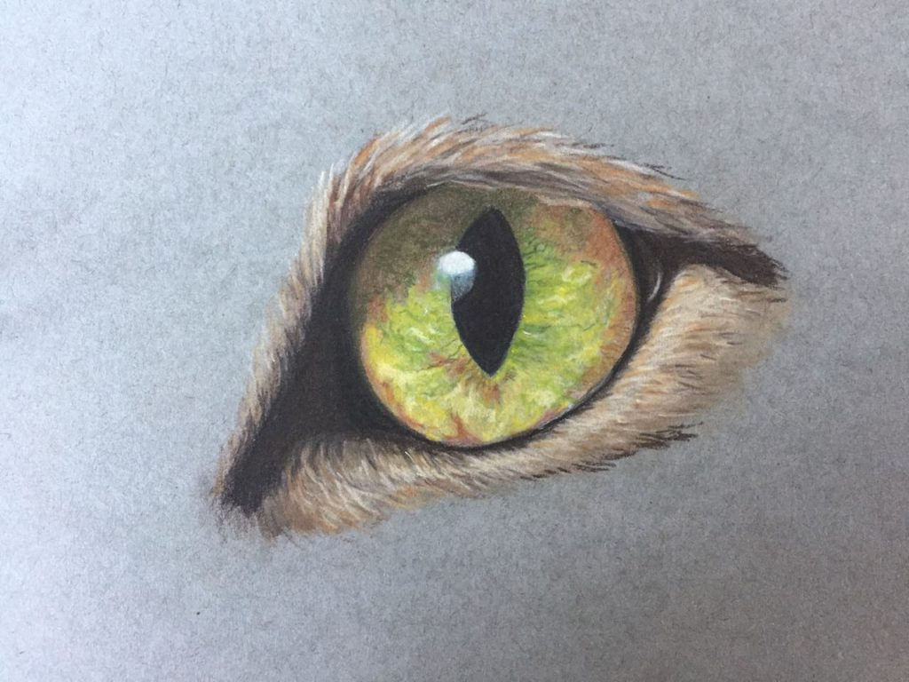
Green Cat Eye 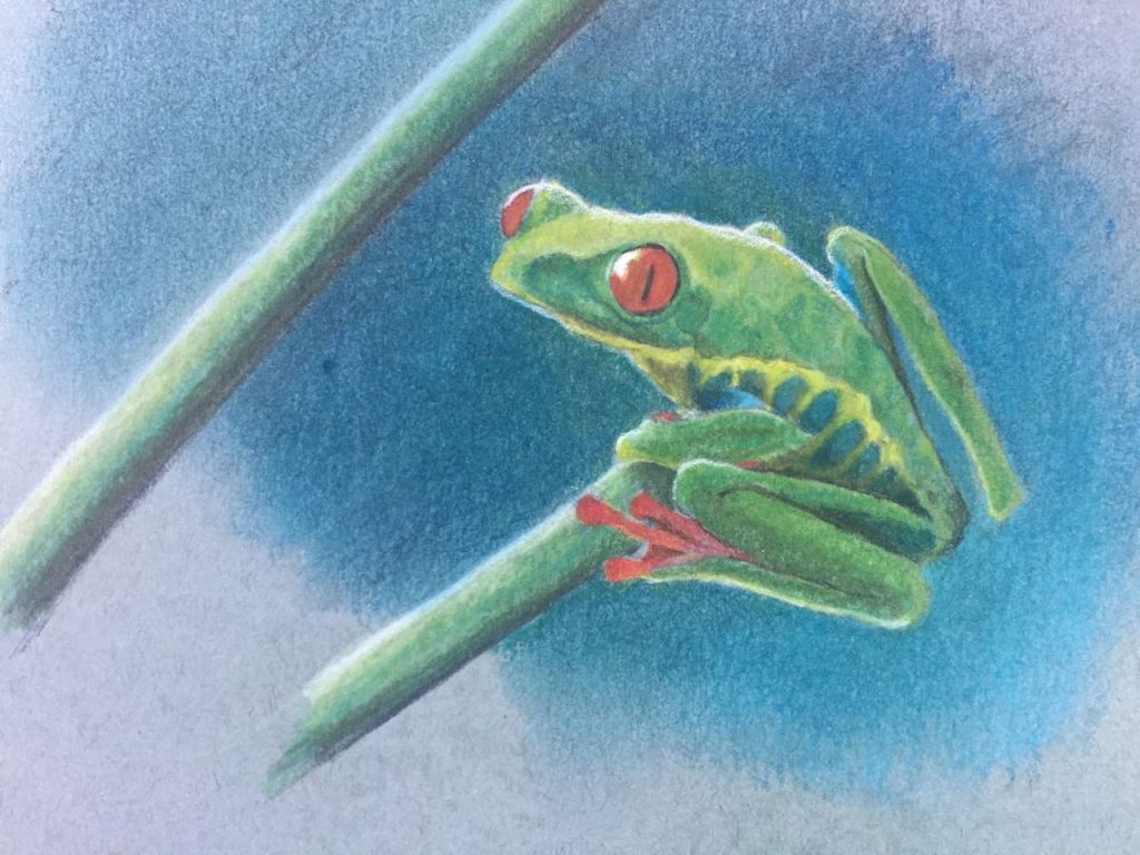
Red Eye Tree Frog
I called these “pastels” but they are specifically Stabilo CarbOthello pastel pencils. I have an ancient set of pastels that I never liked because they make a huge mess and were ‘scratchy’, I’m not sure about the scratchy part, but having pulled them out again now I think my main problem is that I only had 9 colors and it wasn’t enough to do anything. And also I would need to work BIG and that kind of size intimidates me. Buying paper that large is expensive – but I’m adult now with my own budget.
Monstera leaf
I forgot how to cut holes in things and use the gradient tool – but it didn’t take long to figure it out again. I may use this as part of a larger piece later.

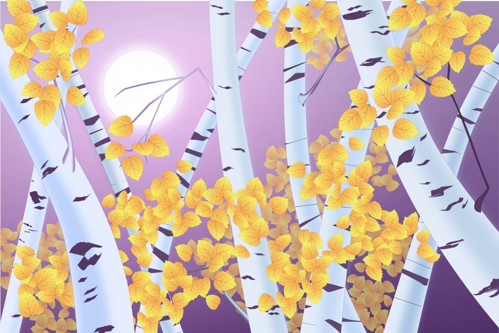
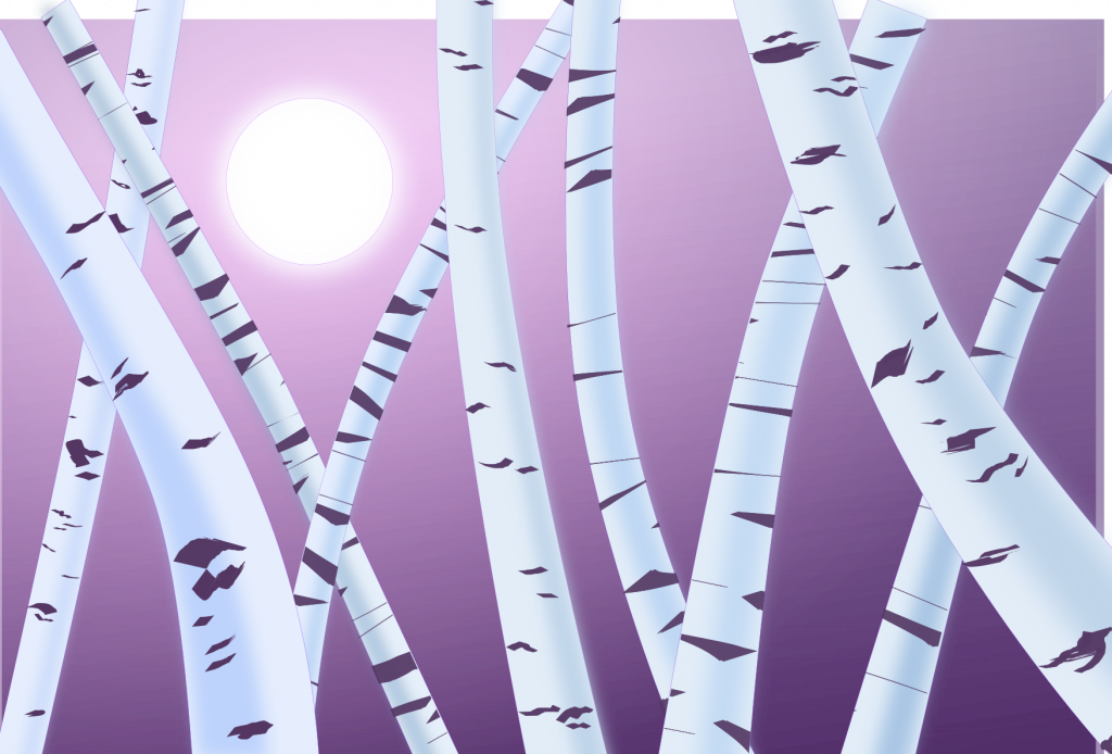
Aspens
I think this is the final but I may add more tiny branches and some detail in the far background.
Night forest and landscape painting
I have several uncompleted works now. I’ve joined some friends to try to learn oil painting – something I’ve never done before. I’ve hardly handled paints at all. But since the oil painting takes so long to work on and I only try once or twice per week, I’ve been sketching, and now putting some inkscape art together. Here’s what I’ve got.
Oil Painting – Week 1 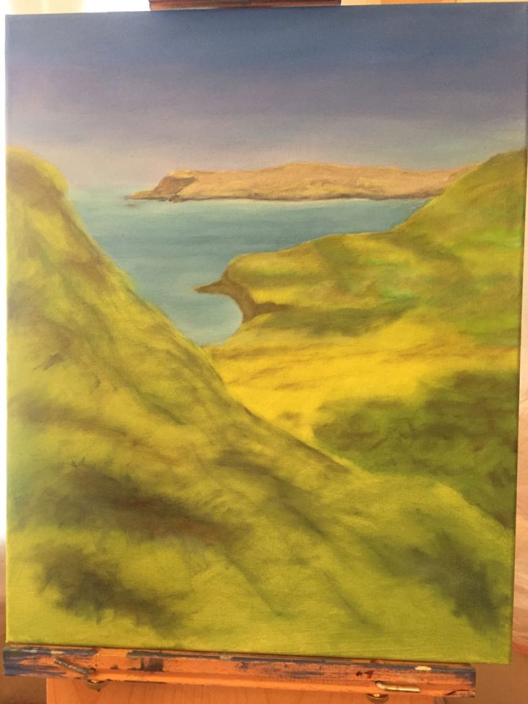
Oil Painting – Week 3 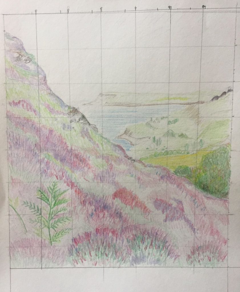
Pencil sketch of original 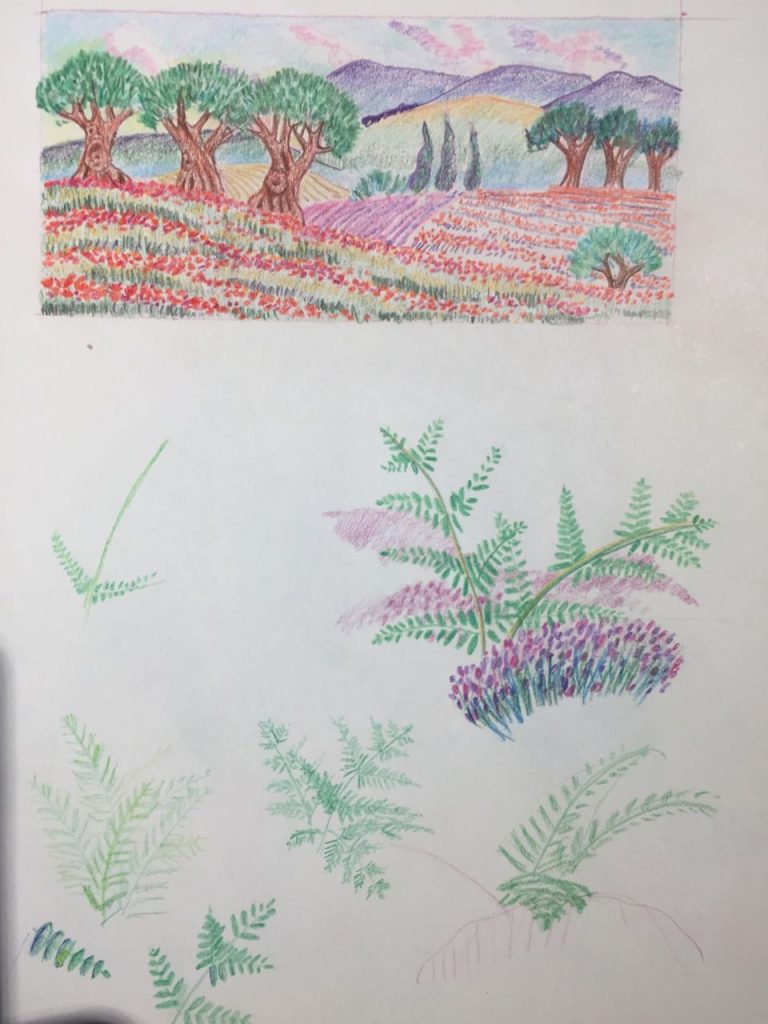
pencil doodles 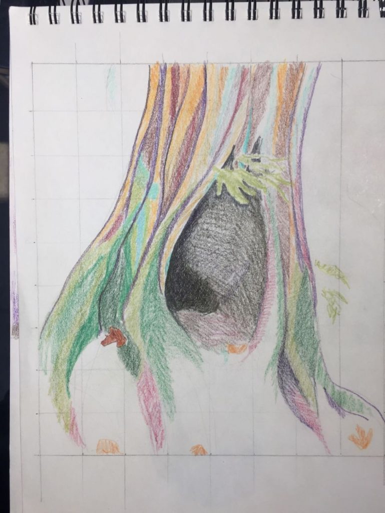
doodle tree 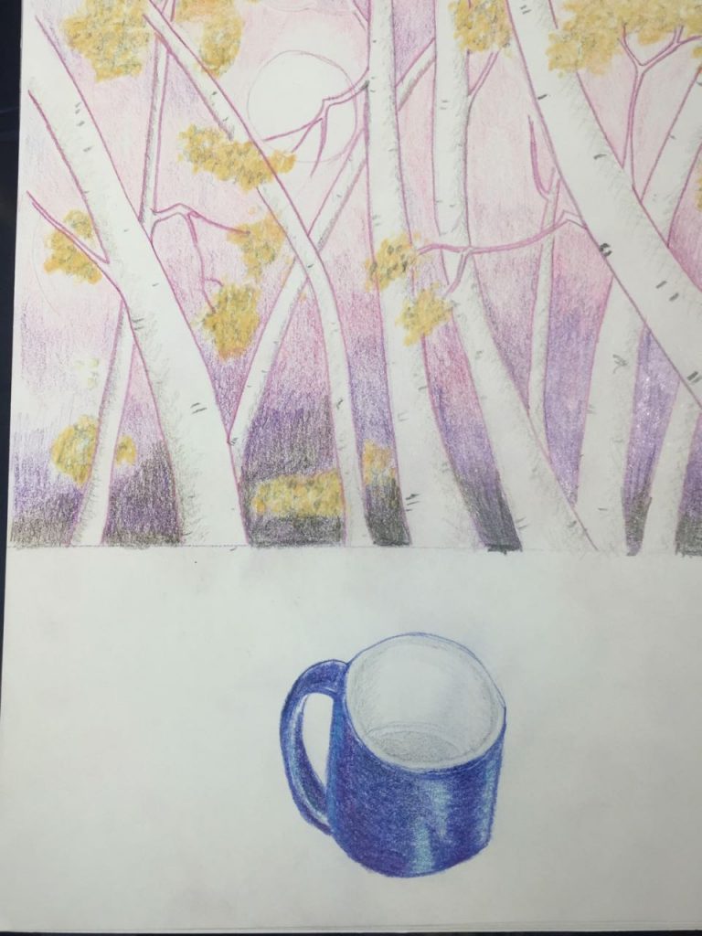
")


